In this beginner guide, you will learn how to effectively use the color palettes of the Kadence theme and how to implement a dark mode with the help of the color palettes and without much effort.
Get Your Own WordPress Website in Just a Few Steps
- Choose hosting provider – if you’re just starting out, I recommend Liquid Web*.
- Register domain – this is often possible directly with the hosting provider.
- Install the latest WordPress version on your domain.
- Install the Kadence Theme – for more complex websites, I recommend installing the Kadence Pro extension* as well.
- To get more design freedom, I recommend installing the block editor extension Kadence Blocks – there is also a Pro Version* with extended functionality.
The Basics of the Kadence Color Palettes
You can find the Kadence color palette in the customizer under Colors & Fonts > Colors. Kadence allows you to define 3 color palettes. However, only one is active on the website at a time.
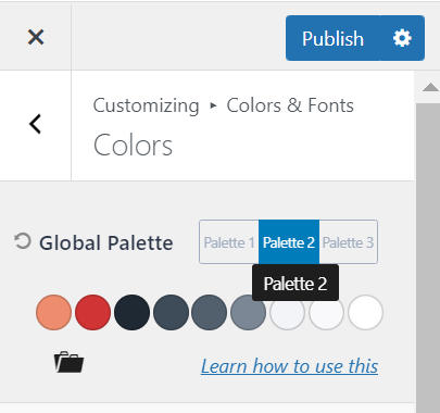
The other two are meant to allow you to quickly customize the look of your website if needed. This makes sense especially in conjunction with Dark Mode, but more on that later.
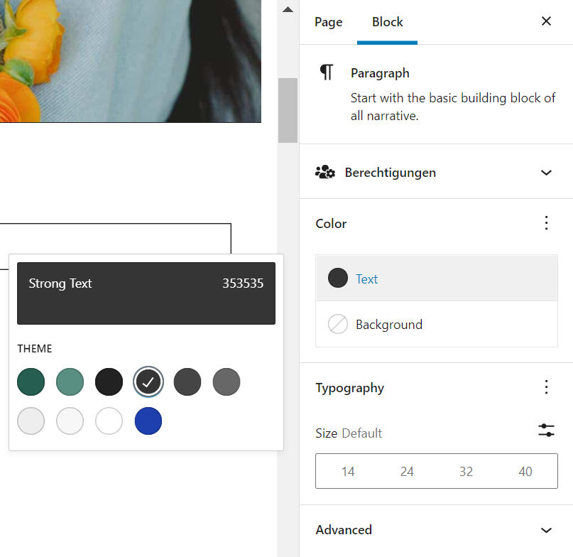
The colors of the color palette can be selected in the customizer and in the respective block settings. This already links the respective theme and block settings to the color palette. In the customizer and in all Kadence Gutenberg blocks, a small globe is then displayed in the center of the color preview circle.
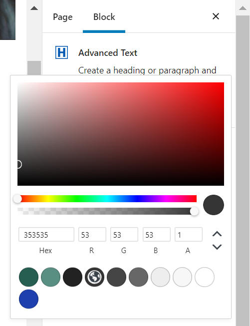
For the standard Gutenberg blocks, the active color palette is also displayed. In the color selection of the respective block you can find it under the heading “Theme”. Here the selection of the color is marked by a check mark, but otherwise there are no differences to the Kadence blocks.
What Is a Global Color Palette?
The great advantage of this color palette is that it is global. But what does that even mean?
Once you’ve linked your theme and block settings to the Kadence color palette, you can easily customize a color from the color palette in the customizer (Colors & Fonts > Colors), and anywhere you’ve used that color in your settings, that adjustment will be applied.
This saves you an extremely large amount of time and gives you the opportunity to quickly and easily test different color combinations on your website.
What Is the Composition of a Kadence Color Palette?
A color palette in the Kadence theme always consists of 9 colors. Each color of the color palette has a certain function, which you should consider in any case when assigning the colors. Let’s go through the colors in order from left to right.
Colors 1 and 2 – Choose the Accent Colors of Your Theme
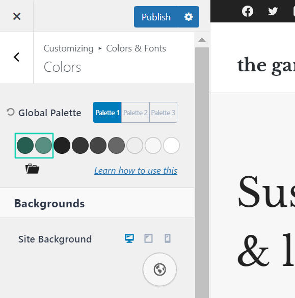
The first two colors are for accent colors, for example your brand color.
Color 1 is usually the original color, in the example the exact hex code of your brand color, and color 2 is the hover color.
Colors 3 to 6 – Define the Colors for Your Typography
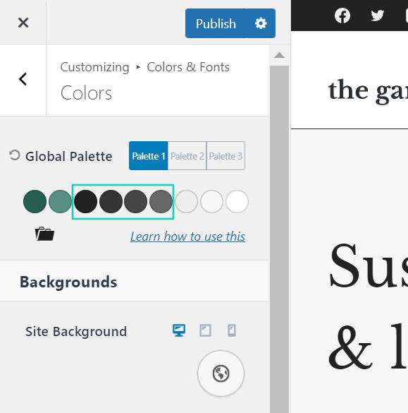
You should use these 4 colors exclusively for the color design of your text elements. Proceed as follows:
Color 3 defines the darkest text color. It is usually used exclusively for headlines.
Color 4 should be a slightly lighter version of color 3. It is used for your body text.
Color 5 should be even slightly lighter than color 4 and can be used, for example, for captions and other text that should not be the center of attention.
Color 6 is intended for placeholder texts/labels of input fields or other elements that should have only a low contrast.
Colors 7 to 9 – Set the Colors for the Background
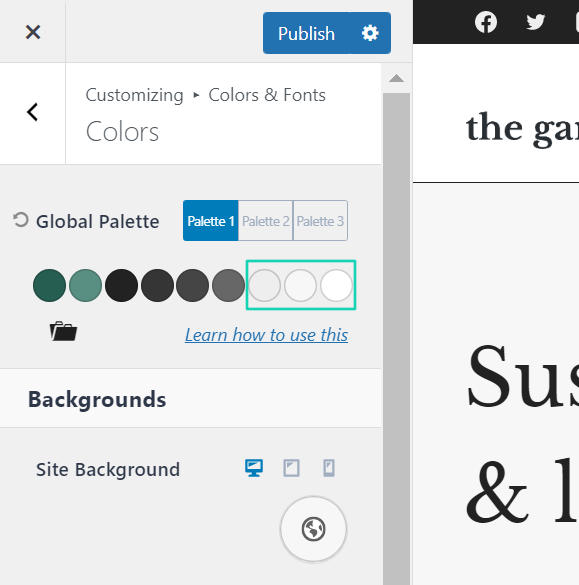
Since modern websites often don’t use just one background color, but need multiple colors for delineating different sections or displaying post previews and other boxes, the Kadence theme gives you the option to set 3 colors for the background.
Color 7 should be the darkest of the 3 background colors – but in a light color palette this will still be a very light color. Here it is important to note that the color is so light that the contrast to color 4 is high enough to guarantee good readability.
Color 8 should be a few shades lighter than color 7. At the latest now, the contrast to color 5 should also be high enough.
Color 9 should be a very light shade of white or even pure white.
This Is How You Import or Export a Color Palette in the Kadence Theme
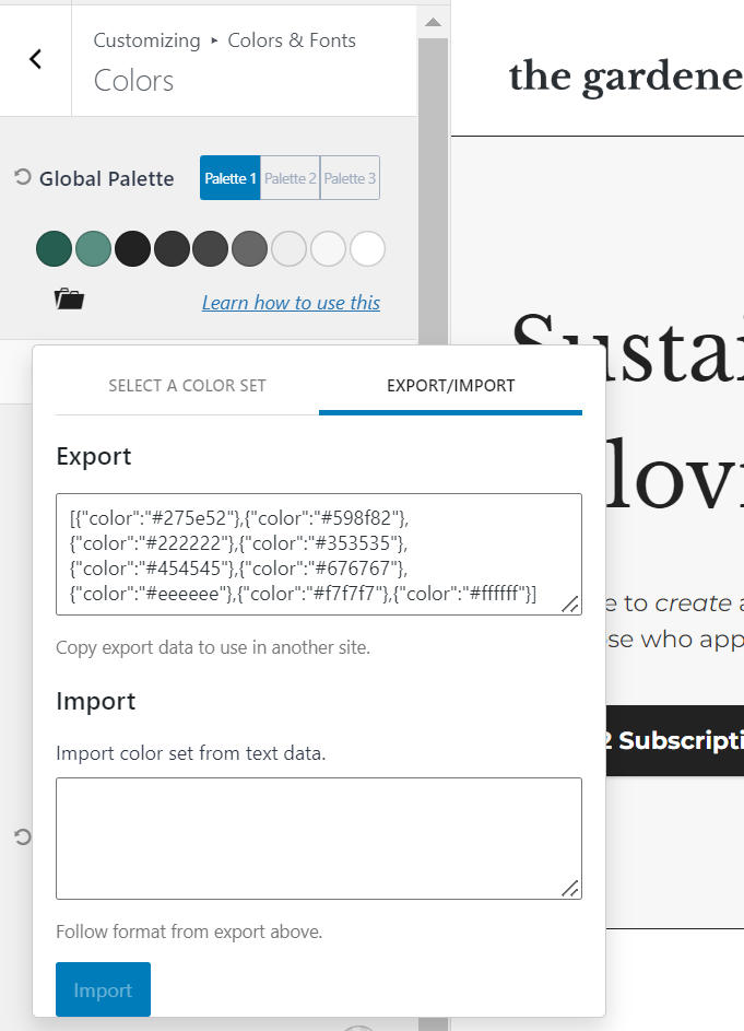
Under each color palette there is an icon of a briefcase. When you click on it, a pop-up appears. There you can select one of 8 predefined color palettes in the left tab and export your selected color palette or import another color palette in the right tab.
Once you find a color palette that is satisfactory for you, you can transfer it to one of your other websites within seconds by copying the displayed code.
Dark Mode in Kadence Theme – Easy Setup Thanks to Multiple Color Palettes
Dark Mode is a relatively new addition to the extensive features of the Kadence Pro theme. It allows your users to change the color palette of your website themselves with the click of a button.
Before you activate the dark mode, you should of course equip one of the 3 color palettes with a dark color palette. To do this, proceed almost exactly as described above.
The only difference with a light color palette is that the brightness of the typography colors should be applied the other way around for a dark color palette. That is, color 3 should be the lightest shade and color 6 the darkest.
In general, when creating a color palette, it’s important to make sure there’s good contrast between foreground and background elements. For example, your accent colors should also stand out strongly enough against the dark background colors.
How To Activate the Dark Mode of the Kadence Theme in the Customizer
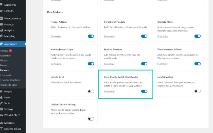
Before you start, you should check if the Color Palette Switch (Dark Mode) option is enabled in the backend under Appearance > Kadence. If not, enable it.
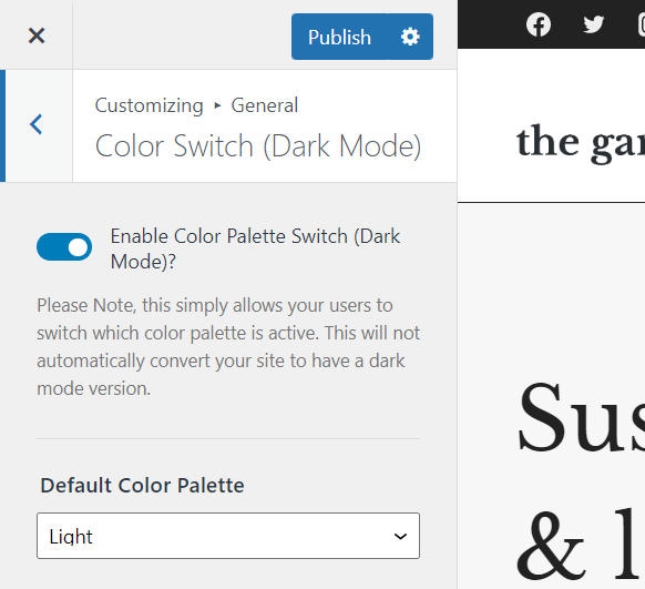
Now you can activate the Dark Mode in the customizer under General > Color Switch (Dark Mode).
Note
In Header Builder, if you have placed the Dark Mode element in the header, it will not be displayed until Dark Mode is enabled under General > Color Switch (Dark Mode).
Here you now have a few options to choose from: First of all, you can choose whether the light or dark color palette is enabled by default for visitors.
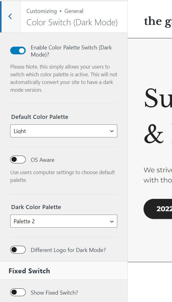
The second option, OS Aware, lets the operating system of your website visitor’s device decide which color palette to choose. For example, many smartphones have the option to automatically activate Dark Mode in an app when in energy-saving mode.
In the third setting, you specify which of your 3 color palettes is the dark one.
If you need a different logo in the header in dark mode, you can specify this in the next two options. Here you have the option to specify either one dark mode logo for all screen sizes or one for desktop and one for tablet and smartphone screen sizes.
This Is How You Can Integrate the Dark Mode Switch on Your Website – The Two Possibilities at a Glance
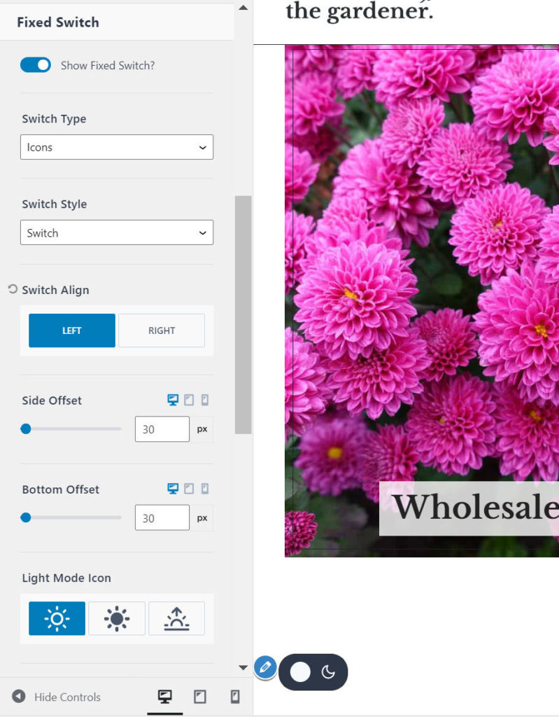
The settings under Fixed Switch allow you to display a dark mode switch that is permanently visible on the screen even when scrolling.
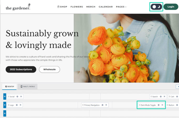
In addition to this display option, you can also display the toggle in the header by placing the Dark Mode Toggle element in the Header Builder (in the customizer under Header) at the desired location.
You Have These Options When Designing the Switcher
The display options are the same for both variants, apart from a few exceptions. I will come to the few differences a little later in the text.
Determine the Switch Type
Specify whether the dark mode toggle consists only of an icon, text, or a combination of both.
Set the Switch Style of the Dark Mode Switch
If you want a button to switch to dark mode instead of an actual toggle, you can set that here.
Select the Icons for the Light and Dark Modes
If you have chosen a Switch Type with Icon, you can select the appropriate icons from 3 different options.
Determine the Size of the Icon
You can set a separate icon size for desktop, tablet and smartphone.
Switch Color
The left color is for the light mode and the right one for the dark ones.
Simply explained: If you are in light mode, the left color – as the color for light mode – is the text/icon color of the switcher and the right color – as the color for dark mode – is the background color.
If you switch to the dark mode, the colors reverse.
Customize the Text Display of the Switcher
With the help of this option you can design the text – provided that you use a switch type with text – of the switch according to your wishes.
Select Titles for Light and Dark Mode
The titles appear when you hover over the toggle with the mouse pointer.
If you have selected the Switch Type icon and Switch Style button, you have the option to activate a tooltip. There the title will also be displayed when hovering over the switch.
You Only Have These Display Options With the Fixed Switch
Switch Align
Decide whether the toggle should be displayed on the right or left side of the screen.
Side Offset and Bottom Offset
With these settings you determine the distance to the right or left and bottom edge of the screen.
Visibility
With this you decide on which screen sizes the fixed toggle should be displayed.
You Only Have These Display Options for the Header Element
Set Margin Values
Specify how much distance the switch should have to the top, bottom, right and left.